Typical Story Lines/Themes: Criminals are ALWAYS caught Dark Mysterious Sad endings
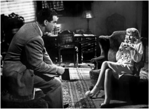
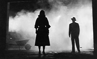
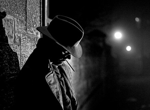
Settings: Dark America Inspired by WW2 Alleyways
Visual Style: black and white Shadows Low-key lighting silhouettes
Chiaroscuro lighting: -extreme low-key lighting;creates distance areas of light and dark.Creates shadow and a moody atmosphere.-
Dutch Angle shot The dutch angle shot shows us that the camera isn't straight so the antagonist is unstable(they're not in the right frame of mind).
COMMON FILM POSTER CONVENTIONS
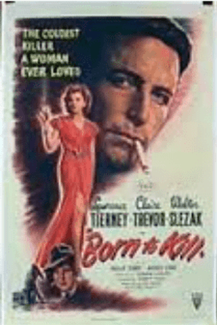
-Tagline- "THE COLDEST KILLER A WOMAN EVER LOVED"
-Key Artwork- Front woman and man
-Main cast -Title- "BORN TO KILL" -BILLING BLOCK -Production company
-Secondary artwork
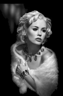
Representation of women in Film Noir films/posters
This poster represents the femme fatale to be cunning as well as manipulative. the colour of the femme fatales dress may suggests mystery as well as power,death, evil and elegance. The cigarette in her mouth may show her personality to be superior as well as rich. This poster represents all women to wear revealing clothes,which helps them manipulate men. as well as show some elegance to how they dress and behave. The layout of the poster gives most of the space to the femme fatale this may tell us that she has the main role in the film. the colours used in the poster are bold dark colours with bright yet dull colours which help make the poster eyecatching. The font of the writing is plain however it curves slightly into the poster giving the poster a final touch to the title.
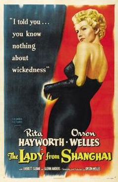
This poster represents women to be elegant and lady like. I know this by the way the femme fatale is standing shows me that she's rich and posh as well as manipulative. This represents women to be more on the classy side rather than sly. The colour of the poster itself is quite bold as well as showing two different colours, this could indicate her two personalities which could be romantic(symbolised by the red) and evil (symbolised by the black). The layout of the poster gives the femme fatale the space, pushing the title to the bottom this maybe telling us that she has most power and control. The font slightly flicks at the end of every word which creates a posh kind of look.
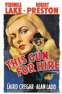
This poster represents women to be "attention seekers" I think this because, the femme fatale takes up more space then the doomed hero. When you first look at the poster you automatically put your attention on the femme fatale and then you notice the doomed hero. The colour of this poster is quite dark as well as bright. The blue background makes the title and femme fatale really stand out catching people's attention.The font of the title bends making the poster look more interesting,the text is also quite big,bright and all in capital letters. I think this is to create a bold kind of feeling rather than a romantic or humorous feeling.
Representation of women in Hollywood films/posters
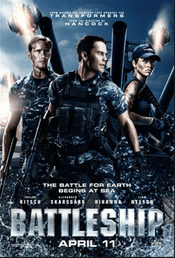
Battleship: Representation of women: This poster represents women to be manly and tough being a countertype as it shows us that the actress Rihanna plays a tough role.This is shown by the tattoos and weapons she has. In contrast to this typical Hollywood females wear much more revealing clothes and they mostly have clear skin rather then having tattoos. On the poster Rihanna looks as if she has a smaller role as although she's at the front of the poster she is behind the two men. Also it shows that she has less weapons then the man in the front as she is holding a gun and he is hold a gun and body vest. This gives us the impression that men are more stronger then women altogether.
Genre? This is an action film, I know this because of the costumes usually action films have manly,less appealing clothes then any other genre.
Target audience?
The target audience is for males aged 17+ I think this because females mostly opt for other genres rather then action.
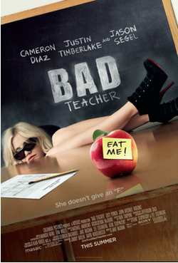
Bad Teacher: Representation of women: This poster represents women to be lazy and careless. Although this poster has used some typical representations of women. For example although we don't know what Cameron Diaz is wearing we can tell that she is wearing something revealing as most of her legs are showing, also most female Hollywood characters wear heals to show a classy yet sassy type of look.
Genre? This is a comedy film, I know this because the way she is sitting isn't dangerous or classy, its more laid back and lazy. It is also telling us that she is a bad teacher (as it says in the title) but it sets the sense of humour because teachers are mostly good whereas she is terrible.
Target audience? The target audience is for teenagers aged 15-18. I think this because younger people wouldn't understand it wheres older people would be more interested in adventure or documentaries.
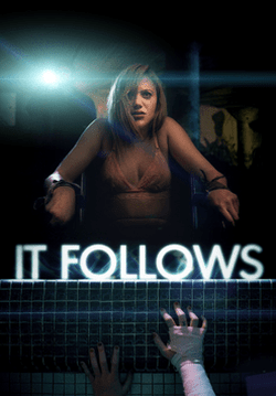
It follows- Representation of women: This poster represents women to be more manipulated.I know this because, the lady in this poster has her hands tied to a chair making her look much more vulnerable. This poster also uses some typical representations of women, for example in most Hollywood films/ posters women are shown to be wearing revealing clothes, this could be used as a prime example as the lady in this poster is wearing very revealing clothes this could also be shown as a way of titling the woman to be a damsel in distress as she would probably be expecting a man to save her. This could show the weaker side of a woman rather then the strong side.
Genre? This is a horror film, I know this because of the colours used as they are all dark, the woman's facial expressions also shows fear and distress she looks uncomfortable. The title "IT FOLLOWS" also doesn't say whether the "IT" is a person or not. The word "IT" puts in the fear of the unknown leaving the audience wondering who? or what? the "IT" is.
Target audience? The target audience is for teenage girls aged 15-19+. I think this is because teenage girls have a scary imagination and girls just like the thrill and the horror rather then boys. I think that older people wouldn't be interested in horror films as they would prefer something else like comedy.